The “Oh, Shit…” and the birth of BBC News Online

Back when I was in architecture school, about one million years ago, one of our tutors – I can’t remember but I think it was the brilliant Malcolm Parry – used to delight in taking us on site visits to semi-famous, or at least distinguished buildings; and then guiding us as fast as he could to an example of what he called the “Oh, Shit.”

The “Oh, Shit” was his short-hand for the condition of best-laid plans meeting reality.

When all the drawings, sections, detailed drawings and meticulous sourcing in the world clash with odd corners of the physical world, weather, materials and not least the vagaries of human labour.

It’s what Bryan Boyer calls the “Matter Battle”. He puts it beautifully:

One enters a Matter Battle when there is an attempt to execute the desires of the mind in any medium of physical matter.

Here’s a prime example of an “Oh, Shit” – on 10 Hills Place by Amanda Levete (which I wrote a little bit about here).

10 Hills Place

Malcolm held that the mark of a great architect or designer was not that there were no “Oh Shits” – he saw it as fundamental natural law that there would be – but how the designer resolved it.

How tasty the lemonade made when the team are handed lemons.

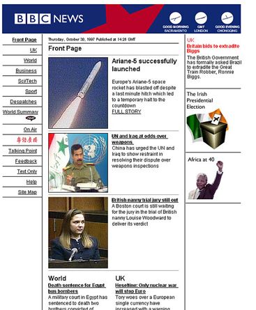
This came to mind when I read the recent article on The Register about the launch of BBC News Online, 15 years ago (!) last month.

I have a bit-part in the article:

Matt Jones’ design team had come up with a set of HTML layouts that followed best practice guidelines, but nobody was wedded to the styling, which made use of putty-like beiges and greys.

The BBC at the time was going through a corporate rebranding exercise, which involved commissioning a new logo from design agency Lambie Nairn. The BBC had used sloping letters for its logo, with few variations, since 1962. Lambie Nairn straightened the characters, and changed the font to Gill Sans, and the letters looked better on computer screens. The new logo had yet to be unveiled to the public, and only be made public on 4 October in 1997. Everyone was ordered to work with the WPP-owned branding agency. So rather reluctantly, the News Online team sent their templates to Lambie Nairn with the invitation to “reimagine” them.

Almost overnight, a junior working at the agency, who had no web layout experience, sent back a new set of designs. “Mike, Bob and I looked at them and thought these were so much better,” said Karas.

Without kicking up a fuss, Jones set to work rewriting the news website’s HTML, even though this meant revising every template in the system. Jones would become creative director after the site’s launch, giving News Online a clean, simple and consistent look, and some clever and subtle touches. Even today, the first News Online pages look clean and modern – one of the few websites from 1997 that hasn’t dated – and look better than their contemporary versions.

A few inaccuracies in this – the chap described as “a junior at the agency” who came up with the Lambie-Nairn proposals was an excellent fellow Welshman called Gareth Mapp, who was in fact a senior designer there at the time, but he came from a print and moving image design background, with no experience of the web. This wasn’t unusual back in 1997.

Also, we’d been working on layout/visual proposals with a small design agency called Sunbather that I’d worked at previously, who were soon to be acquired by Razorfish . Mike Bennett (now of Oil Studios) continued to work with me in the aftermath of the Lambie-Nairn U-Turn to resolve the designs a little more. The brilliant Pete Lane, Sam Urqhart and Jude Robinson really then made the miracle happen turning them into HTML and other front-end code.

Anyway.

This was the “Oh, Shit”.

bbc_demo

Matt Karas remembers me and him sitting in the BBC Canteen, overlooking the fabled Blue Peter Garden – the statue of Petra the dog staring at us judgmentally, while we re-drew every template of every page of the site by hand to figure out how we could make it work.

We had 48 hours from the time the designs from Lambie Nairn came in and Bob Eggington/Mike Smartt approving them, and the deadline for getting the html ready to keep the site on track for launch.

Committing to the new designs, and throwing away the months of work we had done was hard.

But we all felt the “Oh Shit.”

We all felt that the new direction was the right direction.

I think recognising this – when there is a path from a crisis that involves risk but rewards you hugely – with something you wouldn’t have imagined, is at the very heart of design. It’s certainly an incredible feeling when it works, when the judo-flip flows just so, and you end up somewhere brilliant.

That’s something the team at BBC News did 15 years ago – a team I’m really proud to have been a part of.

Design is seedy

From the Seedcamp about pages:

“There will be a diverse mentor network of serial entrepreneurs, corporates, venture capitalists, recruiters, marketing specialists, lawyers and accountants that will help the selected teams put together the foundations of a viable business.”

How about designers?

Technology plays alone are starting to lose their distinctiveness in many of the more-crowded areas of the marketplace.

Great service and interaction design are on the rise as strategic differentiators for products as diverse as the iPhone and Facebook.

Bruce Nussbaum in BusinessWeek:

“Innovation is no longer just about new technology per se. It is about new models of organization. Design is no longer just about form anymore but is a method of thinking that can let you to see around corners. And the high tech breakthroughs that do count today are not about speed and performance but about collaboration, conversation and co-creation. That’s what Web 2.0 is all about.”

The article that’s taken from is entitled: “CEOs Must Be Designers, Not Just Hire Them”.

Not sure I agree about CEOs breaking out OmniGraffle, but what about entrepreneurs?

I wonder how many Seedcamp teams will have a interaction designer on board, as part of the core – or even a designer as the lead entrepreneur?

Are they going to bake great design in from the get-go, or put lipstick on their baby gorillas?

I think it will be the former.

If there’s one Brit caricature of the entrepreneur, it’s the inventor – the engineer/designer/impressario: Baylis, Dyson, Roope!

Nussbaum’s article, in bulk is a speech he gave at the RCA, which traditionally has grown quite a few of those designer/engineer/inventor/entrepreneurs in the world of atoms.

Prof Tom Barker‘s crew springs to mind, as do some of the graduates of the Design Interactions course.

The line between hackers and interaction designers is blurring as they start small businesses that are starting to make waves in the big business press.

As I mentioned, my experience of HackDay Europe was that

“It really does seem that the hacker crowd in London/Europe at least is crossing over more and more with the interaction design crowd, and a new school of developers is coming through who are starting to become excellent interaction designers – who really know their medium and have empathy with users.”

So I have high-hopes.

I’m also glad to say that the Seedcamp team are going to have user-researchers, usability experts and interaction designers in their mentor network, including me for some reason…

Looking forward to it.

May I have this dance?

An end of year message (solicited by the good people at WorldChanging), from every interaction designer’s favourite curmudgeonly spirit-of-Christmas-yet-to-come, John Thackara:

“We’re swamped by innovation, but starved of meaning. So what steps should we take, and in which order?

I believe the solution is to scout the world for situations where the question has already been addressed – whatever the question may be. The Danish theatre director Eugenio Barba describes this as “the dance of the big and the small”. We need to be global hunter-gatherers of models, processes, and ways of living that already exist.

In the same way that biomimicry learns from millions of years of natural evolution, we need to adapt lessons learned by other societies to our present, ultra-local needs.”

And showing that he can aphorise as well as Sterling:

“Where there are gaps, we can invent stuff. But let’s ease up on inventing for it’s own sake: it delivers as much smoke, as solutions.”

Wonderful stuff.

And timely – in the year where BusinessWeek became Ideo’s company brochure, and they seem to have taught everyone else to search-and-replace “design” with “innovation” in order to get into the boardrooms.

Design can be taking away, it can be doing less, it can be doing the-same-but-better. And better. And better.

Sometimes the inventions you need are already exist, but haven’t been honed or applied correctly. We went through a big design exercise this year with our business (and some great help – thanks Scott!) and came to similar conclusions.

The dance of the big and the small continues.

Happy new year.

technorati tags:

Architecture and use

Peter Lindberg has posted a nicely considered piece on computer architecture and it’s relationship to the general meaning of architecture, including this definition by Fred Brooks whom he entered into correspondence with on the topic:

“Computer architecture, like other architecture, is the art of determining the needs of the user of a structure and then designing to meet those needs as effectively as possible within economic and technological constraints. Architecture must include engineering considerations, so that the design will be economical and feasible; but the emphasis in architecture is on the needs of the user, whereas in engineering the emphasis is on the needs of the fabricator.”

I would contend that great architecture has it’s emphasis on the end-user – at least, on the end-user alone.

The emphasis is on the needs of the culture it is to embed itself within; via the consideration of site, place, history, context, ecology, arcology, archeology, climate (interacting with climate both to modify it for it’s inhabitants and it’s immediate external context) and the aesthetic / symbolic impact it may have. Also, the consideration of the end-user’s needs (in architectural terminlogy, the programme of the space) is done with this cultural-embedding in mind. How does the programme mesh with it’s surroundings? Do the end-users of the space feel part of a continuum, whether rural or urban; or isolated and hermetically-sealed off from their surroundings.

Can this extend into software? Clay’s situated-software meme scratches the surface of the above – it’s throwaway in most cases: coop-himmelblau or archigramesque digital urban intervention, not digital architecture or digital urbanism.

What would computer and software architecture that was truly analagous to architecture be like?

Scenarios and storytelling.

Random thought about scenarios. Lots of different times, in lots of different companies; I’ve been in the situation where scenarios are being generated in break-out groups in a workshop, then brought back to the larger group for presentation and criticism.

Now – this type of work is only ever rough-scoping work, and it would be risky to base design work on it without more criticism or validation, but as it’s at the top of the funnel of product or service development often. And also more often than not – it’s done in ‘kick-off’ meets where stakeholders and project influencers who might be so heavily involved in the detailed work further along. So it can have a big influence.

Looking back, I’m wondering how much performance and storytelling influence the creation of scenarios in these situations. That is, when we brainstorm, as social animals, rather than objectively shaping scenarios for further development – how much are we looking for approval and engagement with our stories and ideas from those present?

Related: discussion about persona-driven design and the creation of personas on CHI-WEB.

Kata

Anthony Colfelt has been at the ForUSE conference in New Hampshire, and has an excellent piece on his reflections/conclusions drawn from the experience:

“Larry Constantine said it best in the final conversation that was held between the remaining delegates on the last day. “Process is like the training wheels for learning a craft. When one has gained enough experience one knows when to throw it away.” Ron Jeffries also had a good way of describing process. “Process is like a Kata, you practice techniques over and over and over to make you learn the art…” Having once studied Karate, the notion of practicing set techniques in different combinations really resonated with me. Through practice, you can draw on your route knowledge of individual techniques and combinations of them, to best solve a problem when faced with it.”

» The Vanity Experiment: ForUSE – Conclusions

Processkillers

Erik Benson (excuse the long quote):

“We’ve all participated in processes that have grown stale. Directions will always go bad. So of course someone has to maintain the processes. Hopefully it’s a smart person. But we’re back where we started… the group’s intelligence is still being maintained by an individual, and if that individual leaves the company, he/she will have to be replaced. So companies build processes in order to ensure that the processes are properly maintained. That doesn’t solve the problem though. Someone has to maintain those processes that are maintaining process. Soon, you have a cascade of processes maintaining processes that is so complex that they cannot be maintained by an individual any longer. They become locked and unmaintainable. Then they become stale. Then they make people go down the wrong roads and there’s no simple way to change that.

That’s why I think that building process (alone) is not the correct way to improve the intelligence of a group. If I were in charge of improving the intelligence of a group, maybe I would create process-killing individuals who worked alongside process-making individuals.”

I’ve definitely seen process become dogma in a number of workplaces, particularly around user-centred design.

Theory: because it’s actually common-sense.
Read More »

Design Inquiry

From MIT OpenCourseWare »  Architecture »  4.273 Introduction to Design Inquiry, Fall 2001:

“In this class we entertain the idea that the making of objects facilitates the development of ideas. Such objects are made in different media – words, physical materials, virtual images — and, in turn, these media afford different possibilities for interpretation and manipulation. For example, it is easy to tear away and add to a clay model, not so easy with one made of hard woods; but it is easier with the latter to establish a regular module or repeating shape or motif. There are several roles that such objects can play: to enable the designer him or herself to visualize and make sense out of the world they see and experience; to permit the designer to visualize and to manipulate ideas under consideration; to facilitate communication with others; and to engage the form, materials and structure of the artifact ultimately to be built. Their generative power for the designer may not depend upon precise correspondence, indeed, early in the design process such objects may serve the design process well by being quite different from the ultimate artifact and by suggesting possibilities to the designer unforeseen at the time of their making. And not all intermediate objects can (or should have to) fill all three roles.”

Design inquiry is too hard in software.

More on the BBC Creative-Archive

Danny fires an anti-FUD missile in the direction of my bosses:

“The BBC, in theory, shouldn’t care how many times you share a copy of, say, Dixon of Dock Green. On the contrary, it should thank you. You’re taking the hard work – and cost – out of distributing the works you have already paid for with your licence fee. So not only does the BBC not need to care about Napster and other file-sharing systems – it can actively take advantage of them. Distributing content in this way does not reduce the BBC’s income, but it can reduce its costs. Copy protection devices and clampdowns on internet copying just get in the way of the BBC’s mission.”

» Guardian Online: Auntie’s digital revelation