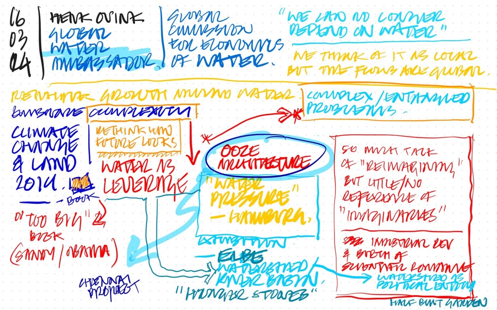
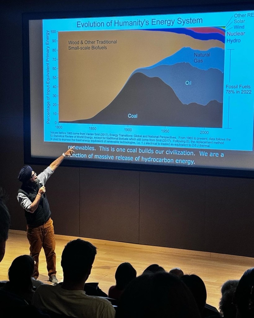
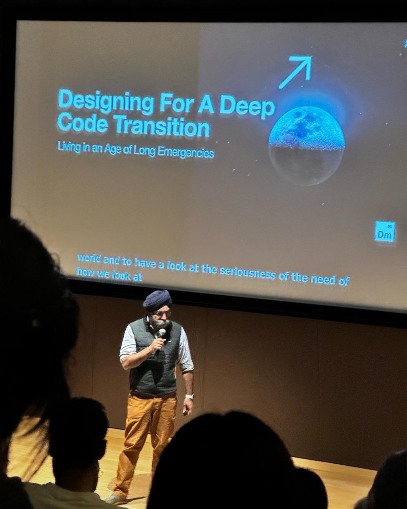
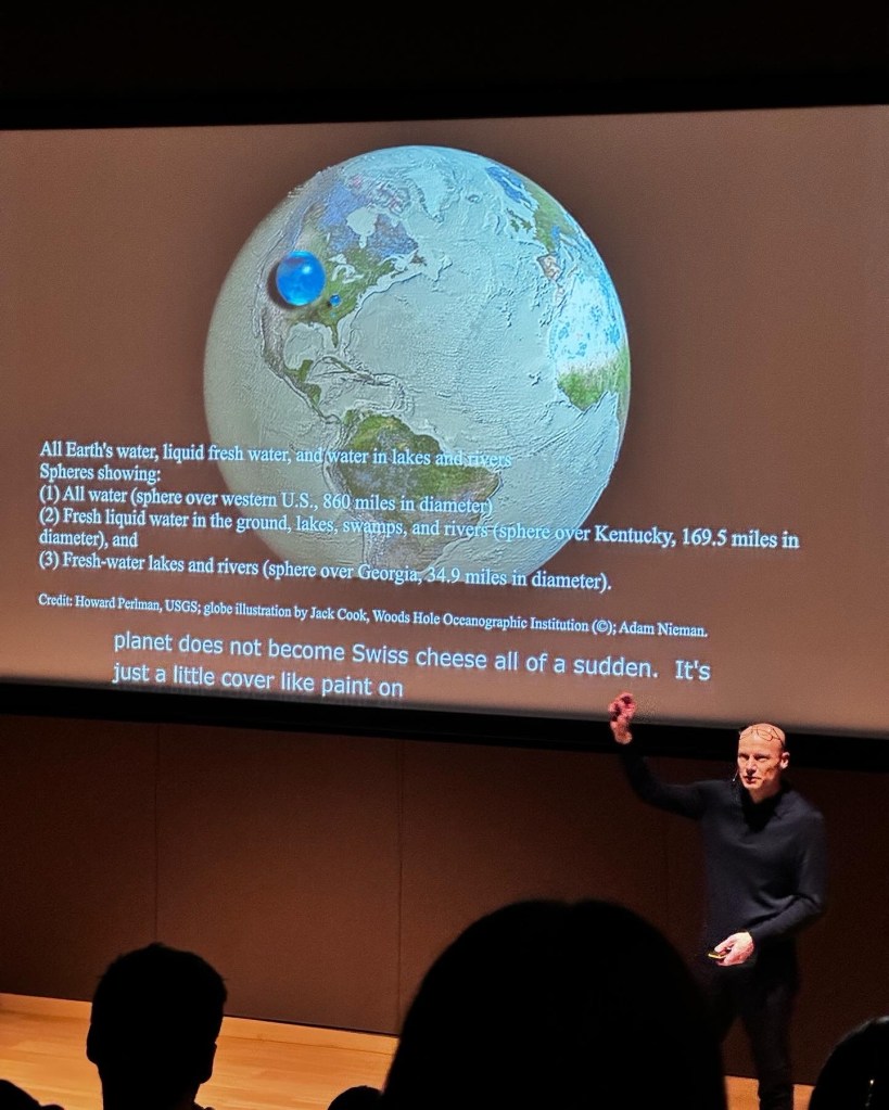
Sketchnotes from The World Around/Future Observatory Observatory event, March 16, 2024

Notes from Indy Johar Talk
Notes from Henk Ovink talk
Notes from Feifei Zhou and Natsai Audrey Chieza talks
Notes from Adrian Lahoud… and a beginning (and end) of notes for Julia King…
Julia King
Indy Johar
Indy Johar
Henk Ovink
Justin McGuirk & Beatrice Galilee

A thought provoking and sometimes heartbreaking event. My note taking trailed off through the event, not a reflection on the presentations other than my being engrossed in them!

More on the event here

The “Oh, Shit…” and the birth of BBC News Online

Back when I was in architecture school, about one million years ago, one of our tutors – I can’t remember but I think it was the brilliant Malcolm Parry – used to delight in taking us on site visits to semi-famous, or at least distinguished buildings; and then guiding us as fast as he could to an example of what he called the “Oh, Shit.”

The “Oh, Shit” was his short-hand for the condition of best-laid plans meeting reality.

When all the drawings, sections, detailed drawings and meticulous sourcing in the world clash with odd corners of the physical world, weather, materials and not least the vagaries of human labour.

It’s what Bryan Boyer calls the “Matter Battle”. He puts it beautifully:

One enters a Matter Battle when there is an attempt to execute the desires of the mind in any medium of physical matter.

Here’s a prime example of an “Oh, Shit” – on 10 Hills Place by Amanda Levete (which I wrote a little bit about here).

10 Hills Place

Malcolm held that the mark of a great architect or designer was not that there were no “Oh Shits” – he saw it as fundamental natural law that there would be – but how the designer resolved it.

How tasty the lemonade made when the team are handed lemons.

This came to mind when I read the recent article on The Register about the launch of BBC News Online, 15 years ago (!) last month.

I have a bit-part in the article:

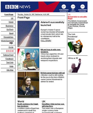
Matt Jones’ design team had come up with a set of HTML layouts that followed best practice guidelines, but nobody was wedded to the styling, which made use of putty-like beiges and greys.

The BBC at the time was going through a corporate rebranding exercise, which involved commissioning a new logo from design agency Lambie Nairn. The BBC had used sloping letters for its logo, with few variations, since 1962. Lambie Nairn straightened the characters, and changed the font to Gill Sans, and the letters looked better on computer screens. The new logo had yet to be unveiled to the public, and only be made public on 4 October in 1997. Everyone was ordered to work with the WPP-owned branding agency. So rather reluctantly, the News Online team sent their templates to Lambie Nairn with the invitation to “reimagine” them.

Almost overnight, a junior working at the agency, who had no web layout experience, sent back a new set of designs. “Mike, Bob and I looked at them and thought these were so much better,” said Karas.

Without kicking up a fuss, Jones set to work rewriting the news website’s HTML, even though this meant revising every template in the system. Jones would become creative director after the site’s launch, giving News Online a clean, simple and consistent look, and some clever and subtle touches. Even today, the first News Online pages look clean and modern – one of the few websites from 1997 that hasn’t dated – and look better than their contemporary versions.

A few inaccuracies in this – the chap described as “a junior at the agency” who came up with the Lambie-Nairn proposals was an excellent fellow Welshman called Gareth Mapp, who was in fact a senior designer there at the time, but he came from a print and moving image design background, with no experience of the web. This wasn’t unusual back in 1997.

Also, we’d been working on layout/visual proposals with a small design agency called Sunbather that I’d worked at previously, who were soon to be acquired by Razorfish . Mike Bennett (now of Oil Studios) continued to work with me in the aftermath of the Lambie-Nairn U-Turn to resolve the designs a little more. The brilliant Pete Lane, Sam Urqhart and Jude Robinson really then made the miracle happen turning them into HTML and other front-end code.

Anyway.

This was the “Oh, Shit”.

bbc_demo

Matt Karas remembers me and him sitting in the BBC Canteen, overlooking the fabled Blue Peter Garden – the statue of Petra the dog staring at us judgmentally, while we re-drew every template of every page of the site by hand to figure out how we could make it work.

We had 48 hours from the time the designs from Lambie Nairn came in and Bob Eggington/Mike Smartt approving them, and the deadline for getting the html ready to keep the site on track for launch.

Committing to the new designs, and throwing away the months of work we had done was hard.

But we all felt the “Oh Shit.”

We all felt that the new direction was the right direction.

I think recognising this – when there is a path from a crisis that involves risk but rewards you hugely – with something you wouldn’t have imagined, is at the very heart of design. It’s certainly an incredible feeling when it works, when the judo-flip flows just so, and you end up somewhere brilliant.

That’s something the team at BBC News did 15 years ago – a team I’m really proud to have been a part of.

Long life / loose-fit / low ennui

Which is a pun headline that will only work for a very few people.

The critical writing that has gathered around my “city as battlesuit” post has gathered something like critical mass – and it’s way more interesting and better written than what I dashed out for io9.

Go read:

As for the ‘testosterone-fuelled technoptimism‘ aspects of my writing, well – it’s a fair cop. In my defense I was writing with limited time in a busy week for a science-fiction site, rather than for my critical theory phd advisor, so y’know.

Which is not to say that phds in critical theory are bad things either.

Gah.

So I guess what I’m trying to say is, I’m sorry if using the term ‘battlesuit’ seemed to trivialise war, the military, weaponry etc. all things I have no direct experience of – and hope never to experience.

This was not my intention. I was simply trying to use an attractive metaphor to grab people’s attention on a science fiction site trafficked by people as adolescent as me and get them interested in the critical discourse of clever people, like you.

The most important part of the sentence for me was ‘surviving the future’ – for which I still believe cities are the key.

This is why I stopped blogging, isn’t it.

And this is why Russell ends his posts with “anyway“.

Anyway.

T5: Expectations of agency

.flickr-photo { border: solid 2px #000000; }
.flickr-yourcomment { }
.flickr-frame { text-align: left; padding: 3px; }
.flickr-caption { font-size: 0.8em; margin-top: 0px; }

I’m in Oslo for a few days, and to get there I went through Heathrow’s new and controversial Terminal Five. After all the stories, and Ryan’s talk on the service design snafus it’s experienced I approached my visit there with excitement and trepidation.
Excitement still, because it’s still a major piece of architecture by Richard Rogers and Partners – and sparkly new airports are, well, sparkly and new.
YMMV, especially as we were travelling off-peak, but – it was pretty calm and smooth sailing all the way. I’m guessing they’ve pulled out all the stops in order to get things on an even-keel.
Saw both pieces installed in the BA Club Lounges by Trokia (‘Cloud’ and ‘All the time in the world’), both of which were lovely – you can get to see them both without having to be a fancypants gold carder, which is good.

The thing that struck me though was the degree of technological automation of previously human-mediated process that were anticipated, designed and built – that then had to be retrofitted with human intervention and signage.
It’s a John Thackara rant waiting to happen, and that’s aside from all the environmental impacts he might comment on!

My favourite was the above sign added to the lifts that stop and start automatically, to make sure you understand that you can’t press anything. Of course, we’re trained to expect agency or at least the simulation of agency in lifts – keeping doors open, selecting floors, pressing our floor button impatiently and tutting to make the lift go faster. Remember that piece in James Gleick’s FSTR where lift engineers deliberately design placebo button presses to keep us impatient humans happy? People still kept pressing the type panels – me included!
To paraphrase Naoto Fukasawa: sometimes design dissolves in behaviour and then quickly sublimates into hastily-printed and laminated signage…

Fortress of Amplitude

.flickr-photo { border: solid 2px #000000; }
.flickr-yourcomment { }
.flickr-frame { text-align: left; padding: 3px; }
.flickr-caption { font-size: 0.8em; margin-top: 0px; }

This is a scheme called “Urban Freeflow” by Ben Stuart, of Nottingham University that’s featured in Blueprint magazine this month.

I can’t find it online anywhere, so apologies for the poor image.

It’s a training facility for traceurs – practitioners of Parkour, or free-running.

Beautifully-rendered – a Hugh Ferris production study for a Luc Besson straight-to-video movie.

I find it fascinating – an architecture specifically for superhumans.

Imagine designing a system, a city – of engineered environments and inhabitants.

Stilts and grids

Two pieces from yesterday’s Guardian evocative of the post-North-Atlantic Conveyor context of future design.

First, Jonathan Glancey on Alison Brooks’ ‘Salt House’:

“The origami-like geometry of the Salt House’s roofs and walls fold and unfold through the interior, creating a surprising, beautifully lit flow of domestic space as if this was some kind of enclosed seaside landscape to explore, play and relax in rather than the disjointed maze of a conventional new home. The important thing about the Salt House, from a technical point of view, is that it is designed to withstand the floods that will surely come this way, and with some force.

The house stands on stilts, not that you would notice them. Decking spreads out across the site, hiding the fact that the house has been raised up so that surge tides will pass beneath it. The ingenuity of the plan; the commonsense approach to the fact that south-east England is increasingly prone to flooding; the spirited yet subtle energy of its design – all this make the Salt House one of the best new out-of-town houses in Britain today.”

Second, Ruaridh Nicoll’s recollections of growing-up offgrid in Scotland, and the rhythms of life generated by their family generator:

“Until the pylons came, the beast in the shed would dictate the rhythms of our existence. The expense meant that the machine would be turned off when it wasn’t needed, giving my father an extraordinary power over our lives. In Sutherland, in winter, the sun sets at 3.30pm. It was two miles to the nearest house. The darkness was absolute once the generator was off.

The pylons arrived in the mid-1980s and the generator turned from master to slave, a luxury to be used smugly during power cuts… The wilderness itself was pushed back, to reside weakly in the lead pipes and the failure of a television signal to penetrate the deep glen.”

This has been a post in the style of Dan Hill

People making places

People make places @ Demos

Just wandered tonight along to Demos for the launch of their “People make places” report. A skim on the bus home made it seem the sort of thing I would like the Dan Hills and Anne Galloways of the world to have a look at…:

“The rise of privately owned corporate malls, out-of-town shopping centres and the virtual landscapes of the internet have cast doubt on the publicness of our towns and cities. Privatised space is seen to be in the ascendancy and, it is argued, this is squeezing out the possibility of shared social spaces in our cities, replacing them with a ‘shopping mall culture’ of sanitised, frictionless consumer environments where architecture and technology are used to filter out undesirable people and groups. So far it is unclear whether the new set of public spaces created through the urban renaissance are countering this trend and proving effective hosts for shared public life and exchange between people, or whether they are adding to the loss of publicness by imitating the character of private space. Many of the shiny new quaysides and squares seem either curiously empty of people or curiously monocultural in the type of people they attract.

The mission of Demos over the past 12 months has been to take on this uncertainty and track down the public life of cities – to identify the shared spaces of interaction and exchange, the value that such spaces generate and how that value is created. We explored in depth three cities in the UK – Cardiff, Preston and Swindon – to discover and illuminate the processes by which the public life of cities more widely might be reinvigorated.”

I arrived a little late as I only read about the event on the train back from Farnborough, so I don’t know whether it was covered before I got there, but there was little on the effects of digital technology, particularly personal, mobile digital technology on the use of public space. The debate wasn’t all that, although Greyworld were exciting – pointing out the role of play and playful technologies in invigorating and maintaining public spaces.

There’s a small mention of the venerable grassroots geoguide Knowhere in the report, but otherwise very little investigation it seems (again, I haven’t read it in great depth yet) of the impacts of digital technology.

There is a tantalising section heading: “Visible and invisible choreography” on page 62 of the report [PDF], with a brief mention of NYC’s “311” phone line as a concrete example – but nothing about pershaps, how space and place can be ‘reprogrammed’ smartmobs-style by mobile technologies, or how invisible infrastructures can change a place, e.g. free wifi in Bryant Park. I’m sure there are better examples, but hopefully you get my drift (derive?)

Worth a read, and as I say, I hope some of the more hardcore cyburbanists I know will offer their 2p…

Walking City: 21st Century Mirrorworlds remix

Walking_remix_1

^ Comparison of YRM/Tom Carden’s  ‘Destinations’ (Detail) with Ron Herron/Archigram’s ‘Walking City’ (reversed out-of-black by me)

Congratulations to Tom Carden on getting a piece selected for the architecture section of The Royal Academy’s prestigious Summer Exhibition this past year. It’s called ‘Destinations’ and is a beautiful simulation of passenger movements through an airport terminal over a day. 

Many things notable about this: that an artifact that is a simulation of flow through architecture is included in a celebration of the aesthetics of architecture, that these complex simulations of ‘people weather’ are not only working tools of large-scale architectural practice, but also now boundary objects that communicate to wider audiences, and that as David Gelertner put in his mid-90’s book MirrorWorlds, that now we have the power to make magic mirrors of what might be, how does that inform our actions – as architects, designers and citizens.

I was fortunate to sit down and have a chat with Tom this week in London, where we talked about simulation, visualisation, cities and agency and if those sorts of fields fascinate you, too, I recommend subscribing to his blog, Random Etc.

The other thing that struck me about Tom’s image was it’s superficial resemblence to Ron Herron’s iconic Walking City – appealing, as it’s an image of that peculiar 21st century transient city: the airport and it’s inhabitants – walking…

—–
See also: Rodcorp’s "life in the walking city" [via Anne G. to whom I apologise for the non-ironic utopian, technological, democratic discourses I hope she keeps reading 😉
]

Architecture and use

Peter Lindberg has posted a nicely considered piece on computer architecture and it’s relationship to the general meaning of architecture, including this definition by Fred Brooks whom he entered into correspondence with on the topic:

“Computer architecture, like other architecture, is the art of determining the needs of the user of a structure and then designing to meet those needs as effectively as possible within economic and technological constraints. Architecture must include engineering considerations, so that the design will be economical and feasible; but the emphasis in architecture is on the needs of the user, whereas in engineering the emphasis is on the needs of the fabricator.”

I would contend that great architecture has it’s emphasis on the end-user – at least, on the end-user alone.

The emphasis is on the needs of the culture it is to embed itself within; via the consideration of site, place, history, context, ecology, arcology, archeology, climate (interacting with climate both to modify it for it’s inhabitants and it’s immediate external context) and the aesthetic / symbolic impact it may have. Also, the consideration of the end-user’s needs (in architectural terminlogy, the programme of the space) is done with this cultural-embedding in mind. How does the programme mesh with it’s surroundings? Do the end-users of the space feel part of a continuum, whether rural or urban; or isolated and hermetically-sealed off from their surroundings.

Can this extend into software? Clay’s situated-software meme scratches the surface of the above – it’s throwaway in most cases: coop-himmelblau or archigramesque digital urban intervention, not digital architecture or digital urbanism.

What would computer and software architecture that was truly analagous to architecture be like?

We built this city

on…

well… not rock and roll it seems. This from the online prospectus for a course by the London Consortium MRes/Phd course: “Shit and civilization: our ambivalent relationship to ordure in the city, culture and the psyche”:

“Our societies are, quite literally, founded on shit. Civilization means living in cities and cities are confronted, in a way more dispersed settlements are not, with heaps of garbage and ordure.

The course brings together two distinct disciplinary registers, architecture and the analysis of the built environment, and anthropology and psychoanalysis, to show this ambivalence. Thus the phenomena of the built environment and the cultural rules and psychical formations that seek to contain the pollution of matter out of place will be examined together. Shit in contemporary art and film will also be considered in the course.”

» http://www.londonconsortium.com/shit.htm