Warning: a collection of half-formed thoughts about time, screens, AI agents, and a surprisingly relevant Japanese arcade genre.
This started with a phrase in Azeem Azhar’s piece about his AI agent workflow: “wall-clock time.”

It’s a term of art in programming: the actual elapsed time on the clock on the wall, as opposed to CPU time or token throughput or any other measure of what the machine is doing internally.
I hadn’t come across it before, despite having spent years thinking about time and technology, and it lodged in my head.
The interesting thing there for me about AI agents isn’t just how much they can do, it’s the growing gap between the machine’s time and the human’s time.
An agent can burn through a hundred million tokens in a day. The wall-clock time for the human supervising it is the same twenty-four hours it always was.
And then the BCG/HBR AI brain fry study landed earlier this month. Workers who oversee multiple AI agents report 33% more decision fatigue, 39% more errors, and a distinctive “buzzing” sensation, a mental fog that participants struggled to name until the researchers gave them one – “Brain Fry”. 14% percent of AI-using workers report this brain fry. In marketing, it’s 26%.
Steve Yegge, who’s been building Gas Town: a multi-agent orchestrator for managing colonies of 20+ parallel AI coding agents – wrote about the same phenomenon a few weeks earlier, in a post he called “The AI Vampire.”
His framing was vivid: AI makes you 10x more productive, but the productivity comes at a cost the industry hasn’t named yet. Yegge described sudden “nap attacks”: collapsing into sleep at odd hours after long vibe-coding sessions — and observed that friends at other AI-native startups were reporting the same thing.
His image was Colin Robinson from What We Do in the Shadows: an energy vampire, sitting on your shoulder, drinking while you (it? both?) code.

The work is exhilarating and draining, simultaneously, because AI automates the easy parts and leaves you with an unbroken stream of hard decisions compressed into the same number of hours.
Both accounts are being framed, mostly, as a UX problem (better dashboards), a training problem (up-skill your people), or a management problem (set limits). All valid?
But it seems to me that something else is going on — something older and more structural — and it has to do with clocks.
Time Machine Go!
There’s a long, rich body of work about what technology does to the experience of time, and I keep coming back to it. (I’ve been circling this for a while — a talk at DxF in Utrecht back in 2009, “All the Time in the World,” about how human cultures construct time and how designers might deconstruct and reconstruct it; the grain of spacetime as a design material; antichronos and the compound nature of time; the notion of chronodynamic design.
But the brain fry study has maybe sharpened something for me.
E.P. Thompson’s “Time, Work-Discipline, and Industrial Capitalism” (1967) is the essential starting point. His argument: clock-time is not a natural given. It’s a technology, imposed by the factory system.
Pre-industrial societies worked to task-time — you milked the cow when the cow needed milking, you fished when the tide was right. The mechanical clock and the factory bell imposed a different regime: synchronised, disciplinary, abstract. And crucially, it wasn’t just imposed from above: it was internalised, through schooling, religion, print culture, until it felt like common sense.
James Carey showed how the telegraph extended this further — it could transmit time faster than a train could carry it, which is how we ended up with standardised time zones. The telegraph didn’t just speed up communication; it made wall-clock time universal. And then came the step that I think matters most for where we are now.
David Rooney’s About Time traces what happened when precise, synchronised time could be distributed electrically — wired clocks in factories, schools, railway stations, town squares. The Brno electric time system of 1903 is his case study.
Once the infrastructure existed to push accurate time into every public space, clock-discipline stopped being merely an economic requirement and became a moral one.
Punctuality became a virtue. Being on time was being a good citizen, a reliable worker, a decent person. The machinery of timekeeping was internalised so completely that it ceased to look like machinery at all — it looked like character. Electric time could be exported across the industrialised world not just as coordination but as morality.
Carolyn Marvin, in When Old Technologies Were New (1988), demonstrated the same pattern from a different angle: every new medium — telephone, electric light, radio — was received as “new” precisely to the extent that it seemed to annihilate time and distance.
The rhetoric is remarkably consistent across eras.
We’ve been having the same conversation about technology conquering time for about a hundred and fifty years.
So wall-clock time — the time of schedules, meetings, train timetables — was already a technological imposition on older, bodily rhythms.
It’s not the “natural” baseline against which AI’s speed is measured. It’s just the previous generation’s machine. And — per Rooney — it’s not just a machine. It’s a machine that learned to dress up as a moral principle.
But something has shifted.
Félix Guattari distinguished between human time and machinic time: the former mediated by clocks and institutions, the latter operating at computational speeds that exceed human perception entirely. Hartmut Rosa calls it the “shrinking of the present” — the window in which your past experience reliably predicts the future gets narrower with each acceleration. And Paul Virilio spent decades developing what he called dromology — from the Greek dromos, a racetrack — essentially a science of speed.
His argument was that the history of civilisation is not primarily a history of wealth or territory but of velocity: who controls the fastest, densest barrage controls the territory. Each new speed technology — the stirrup, the railway, the telegraph, the missile, the fibre-optic cable — reshapes not just logistics but perception itself.
Speed doesn’t just let you move more easily; it changes what you can see, hear, and think. Push acceleration far enough and you get what Virilio called the “aesthetics of disappearance” — things moving too fast to be perceived at all. The landscape seen from a bullet train isn’t a landscape anymore; it’s a blur. The high-frequency trade executed in microseconds isn’t a decision anymore; it’s a reflex of infrastructure.
The BCG study’s “buzzing” and “mental fog” sit right in this lineage. Railway passengers in the 1840s reported nervous exhaustion at 30mph — what doctors called “railway spine.”
Schivelbusch documented how rail speed literally rewired perception: landscapes became panoramic blurs, attention fragmented, a new kind of fatigue emerged that the medical establishment had no language for. Telegraph operators developed what we’d now recognise as burnout. The body protesting a tempo it didn’t choose.
So maybe, brain fry is the 2026 version of railway spine?
I.E. an embodied protest of a nervous system being asked to run at a tempo it didn’t evolve for.
Brain Fry & Bullet Hell
This came to mind when I was trying to describe the feeling of supervising multiple AI agents to a friend: the way you end up in a state of continuous partial attention, scanning outputs, waiting for something to go wrong, never quite able to look away and I realised the closest analogy I had was danmaku.
For those who haven’t encountered it: danmaku (弾幕, literally “bullet curtain”) is a Japanese arcade genre — sometimes called “bullet hell” — where the screen fills with hundreds of projectiles in elaborate, spiralling patterns. The player’s ship is tiny. The bullets are everywhere. The whole point is overwhelm. Games like Touhou, DoDonPachi, Ikaruga.
Beautiful, punishing, compulsive.
I think Ikaruga was my introduction to them.
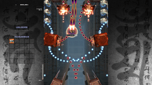
In danmaku, information throughput exceeds conscious processing — you literally cannot track each bullet individually.
The BCG finding that cognitive load spikes after three AI tools describes the same saturation point: too many concurrent streams of machine-speed output for a single human to monitor serially.

But – expert danmaku players don’t get faster. They change how they see.
They shift from focused attention (tracking individual bullets) to a kind of peripheral soft-focus — reading patterns, finding the safe channel through the barrage. It’s a perceptual shift, not a speed upgrade. And it leads, reliably, to flow states. Csikszentmihalyi’s sweet spot: challenge meets skill, self-consciousness dissolves, time distorts in the good way. Players describe it as exhilarating.
So: a human being synchronises their nervous system to machinic time, processes hundreds of parallel streams of machine-speed output, and the result is exhilaration.
Meanwhile, another human being supervises three AI agents producing parallel text outputs at roughly the same structural tempo, and the result is brain fry.
Same physics. Opposite feeling.
I think 3 things account for that gap.
First, consent. The danmaku player chooses the machine’s tempo. That’s the game — you opt in. The knowledge worker has it imposed by a productivity mandate. Thompson again: the difference between dancing and marching is who sets the beat. The factory bell and the AI agent notification are structurally identical — both impose a rhythm from outside the body. One is discipline, the other is play, depending entirely on the power relationship.
Second, legibility. Bullets are unambiguous. A bullet is a threat, a gap is safety, the feedback loop is instant and total. AI agent output requires continuous evaluative judgment — is this correct? relevant? hallucinated? — which loads a different, slower cognitive system on top of the tracking task. You’re playing bullet hell, except some of the bullets might be power-ups, but you can’t tell until you stop and read them carefully. Which rather defeats the purpose of the soft-focus.
Third, reversibility. Die in danmaku, you lose a life and restart. The stakes are emotional, not consequential. If I miss a sloppy AI output — a hallucinated fact, a wrong number, an email sent with your name on it — the damage is real, IRL. The fear of consequential failure however small prevents exactly the relaxed alertness that flow requires.
An excursion to The Bullet Farm
There’s an etymological thing here that I find quite evocative.
弾幕 — danmaku — starts as a military term.
A barrage. Suppressive fire. The purpose isn’t to hit specific targets but to make an entire zone impassable.
The word migrates to arcade games in the 1990s, where the screen becomes the impassable zone.
Then it migrates again to Niconico Douga in the 2000s, where it describes the dense scrolling comment overlays that cover the video — thousands of viewer comments streaming across simultaneously. A curtain of text.
Three instances of the same image: a barrage of projectiles, a barrage of pixels, a barrage of words.
And then (this is where it gets a bit more indulgent, but bear with me) there’s George Miller’s Fury Road.
The Bullet Farmer.

One of three warlords controlling essential resources in a post-apocalyptic economy — water, fuel, ammunition.
His power isn’t that he uses the bullets; it’s that he controls their supply. He doesn’t need to aim. He just needs to fill the zone. Dromology again: whoever controls the fastest, densest barrage controls the territory.
It’s not lost on me that Yegge named his multi-agent orchestrator after the Fury Road settlement. Gas Town — the place that refines and distributes fuel.
In Miller’s economy, Gas Town, the Bullet Farm, and the Citadel form a tripartite monopoly on the resources that make movement, violence, and survival possible.
Yegge’s Gas Town manages the fuel supply for AI coding agents — the orchestration layer that keeps the colony of twenty-plus agents running. But the Bullet Farm is maybe the bit nobody’s building yet: the thing that manages the barrage of outputs those agents produce, and the human attention required to survive it.
Think about this in relation to the AI landscape more broadly. The competitive advantage isn’t in any single agent’s output quality — it’s in the sheer volume and speed of the barrage. Flood the workspace with tools, agents, copilots. The worker, like Furiosa, has to find a path through it.
So the word carries four registers: military (suppress movement), ludic (overwhelm as play), communal (overwhelm as shared experience), and political-economic (overwhelm as resource monopoly). Each preserves the core logic — the barrage as design feature, not failure — but the human’s relationship to it changes completely depending on context.
And AI agent oversight is arguably the first context where the barrage is accidental.
Nobody designed multi-agent workflows to feel like bullet hell.
And yet.
The design problem this reveals
If brain fry is a clock problem — a temporal mismatch between human cognition and machinic speed — then solutions that only address interface design or training will help at the margins but miss the structural issue.
Just as telling 1840s railway passengers to “get used to it” didn’t prevent nervous illness.
The danmaku analogy suggests a different set of questions.
If we want AI agent work to feel more like flow and less like fry, the challenge isn’t making things faster or even slower — it’s about legibility, consent, and reversibility, and all three matter at once.
Legibility first: can agent outputs be designed to be scannable as patterns rather than read as individual documents?
Not better summaries — actual visual or structural affordances that let you soft-focus and spot the anomaly, the way a danmaku player spots the gap in the curtain.
Something closer to a radar screen than a text feed.
Then consent: can workers set their own review tempo? Asynchronous handoffs rather than real-time monitoring. What Sarah Sharma calls “temporal sovereignty” — the right to set your own pace.
The BCG data shows that AI reduces burnout when it offloads repetitive work and increases it when it demands oversight. The variable is who controls the clock.
And reversibility: can we lower the stakes of missing something?
Undo, rollback, draft-before-send, human-in-the-loop-but-not-human-as-the-loop. If the consequence of missing a bad output is catastrophic, the nervous system clenches into hypervigilance.
If it’s recoverable, the nervous system can relax into the peripheral awareness that actually works better for this kind of monitoring.
Anyone remember Braid?

Maybe there’s a hybrid of Braid and git that we need.
I keep coming back to Marvin’s insight that technologies are not fixed natural objects but “constructed complexes of habits, beliefs, and procedures embedded in elaborate cultural codes.” The temporal regime of multi-agent AI work isn’t inevitable — it’s being constructed right now, through design choices and management practices and vendor incentives and labour relations. And — this is the Rooney point again — it’s already being moralised.
Not using AI is starting to be framed as if it’s professional negligence. Not keeping up with the agents feels like a personal failing, not a structural mismatch. The Brno electric clock trick is happening again: a new tempo imposed by infrastructure, dressed up as character.
Punctuality was the virtue of the electric age; throughput is the virtue of the agentic one.

We’ve been here before.
The factory bell, the railway timetable, the telegraph wire, the always-on smartphone — each imposed a new temporal discipline, each produced its own characteristic form of exhaustion, and each was eventually (partially, imperfectly) domesticated through a combination of regulation, design, and collective action.
The question is whether we can do that faster this time.
Or whether — per Rosa’s paradox — acceleration makes the process of adapting to acceleration itself harder. I suspect it’s the latter, but I’d quite like to be wrong.
Let’s see.
Some of the thinking here draws on Thompson, Schivelbusch, Carey, Marvin, Rooney, Virilio, Rosa, Guattari, Crary, and Sharma — a bibliography of people who’ve been worrying about what machines do to time for rather longer than the current AI discourse might suggest. The BCG/HBR brain fry study is by Bedard, Kropp, Hsu, Karaman, Hawes, and Kellerman. Steve Yegge’s “The AI Vampire” and Gas Town are essential reading on the lived experience of multi-agent orchestration.
Colophon: how this was made
It would be dishonest not to mention this, given what the post is about.
Azeem’s piece — the one that started this — was partly authored by his AI agent. So here we are: an agent-assisted post about agent-assisted posts about the experience of working with agents.
Turtles all the way down, etc.
This piece was written with Claude, over the course of a single session. The process went roughly like this: I had a cluster of half-connected thoughts — Azeem’s “wall-clock time” phrase, the BCG brain fry study, Yegge’s AI Vampire, a memory of Carolyn Marvin, the danmaku thing that occurred to me while trying to explain what agent-wrangling feels like, and a book on my shelf I’d been meaning to think harder about (Rooney). I knew there was a thread running through them but I hadn’t pulled it taut.
What Claude did, in machinic time, was the research legwork: finding and synthesising the Thompson-Carey-Virilio-Rosa-Guattari lineage, pulling together the BCG study’s specific data points, confirming citations, searching for connections I suspected existed but hadn’t verified. It produced structured research notes, then a set of blog post ideas, then a draft. Each round took minutes of wall-clock time and involved the kind of parallel literature review that would have taken me days of reading and note-taking.
What I did, in human time, was something different.
I provided the initial constellation of ideas — the specific intellectual connections that felt interesting rather than merely logical. I pushed back on structure and emphasis. I said “does danmaku connect to this?” and “there’s a Bullet Farm in Mad Max” and “what about Rooney’s electric time as morality?” — the sideways moves, the half-remembered things that might or might not be relevant. Honestly at points I felt like a court jester or the class clown in the seminar. I also read drafts with my own sense of voice and rhythm and cut or redirected when it didn’t feel right. The style guide helped here — Claude had a description of how I write, which is a strange thing to hand over, like giving someone your gait analysis and asking them to walk for you.
I don’t think this invalidates the post — if anything, it’s evidence for it. But I wanted to show the working, because it seems important to be honest about the means of production when the means of production are the subject.
The result is something I couldn’t have written this fast alone (or at all?), and something Claude couldn’t have written at all alone — not because it lacks the ability to string sentences together, but because it didn’t have the initial constellation.
It didn’t know that danmaku and the Bullet Farm and Rooney’s Brno clocks belonged in the same thought. Maybe they don’t according to the embedding space.
That pattern-recognition — this goes with this — was the human contribution. The machine contributed speed, breadth, and a tireless willingness to restructure on demand.
Which is, of course, exactly the dynamic the post describes.
I was the player in the bullet hell, trying to maintain soft-focus across the agent’s outputs, steering by feel rather than tracking every token. It was — at various points — exhilarating and a bit draining. Not quite brain fry, but I could see it from where I was sitting.
The temporal mismatch is real: Claude can produce a 3,000-word draft in seconds, and then you spend twenty minutes reading it with the nagging sense that you should be going faster, that you’re the bottleneck, that the machine is waiting.
Rooney’s moralisation of the clock is right there in the room with you.
Why aren’t you keeping up?


