Web things I could really use on my phone, part #47

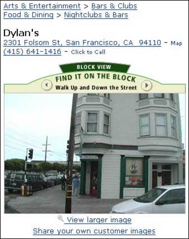
dylans1Amazon’s A9 Yellow Pages search has been causing some buzz around the place, some of it from dear curmudgeonly friends suggesting it is nothing new and that there have been many projects like this over the last 6 or 7 years.
I would suggest the difference is not that A9 have not just made the bear dance, but made it tango.

The user-experience of this service is pretty fantastic compared to predecessors – easy-to-use and with plenty of opportunities for users to refine and feeback on the information.

Inviting users to feedback on which is the most useful picture of a business or landmark is particularly clever, and could generate some fascinating insights for students of Kevin Lynch and other academics of urban persuasion!

Also – the Amazon feature of inviting customers to contribute images could lead to a mappr-like photographic annotation of the United States…

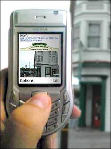
dylans2I guess it goes without saying that this  would become a must-have service if it could be ported sucessfully to the mobile phone, especially if you were trying to find places of high digital repute with pretty anonymous physical presences.

p.s. Dylans in San Francisco that I’ve used to illustrate this post is to my knowledge the only Welsh-themed pub in a world overrun by theme pubs centred around our other celtic cousins, the Irish… I went there a couple of times when the SF Sapient office was around the corner, and they gave me free beer for being able to pronounce Llanfair P.G. in full, bless ’em.

Flickr’s fruit at the bottom

A few new features at Flickr, including the highly-useful-but-not-immediately-obvious inline editing of picture titles (hover over the title of one of you pictures and click to rename, just like on your dekstop, very handy) but the one that caught my eye was the introduction of a task-oriented, mini sitemap on the bottom of every page.

Flickrbottom_1

This is something that I tried to get done while at the BBC, as an unobtrusive wayfinding strategy for the entire http://www.bbc.co.uk site. We (Gee-Kay, Byju and myself) got as far as paper-prototyping and user-testing the idea before hitting the wall of unavailability of resources and internal politics that often stops such things in such places.

The idea continued in a limited form in the iCan project, where we (Priya, Helen, Julie, Andy and myself) used the bottom-of-the-page reference design for a ‘cycling’ pattern of recent visited links and common tasks.

The bottom-of-the-page wayfinding idea was one that I first came across from Peter at PoorButHappy, and was struck by how simple and effective it was.

For what it’s worth, here’s a presentation that I used to try and sell the idea internally in the BBC, including user-test results.

» Download locatedness.ppt [2.3mb powerpoint]

I shared it with Stewart at the time (as we were arguing about spatial metaphors in navigation and wayfinding*) and he told me this week he remembered reading it while waiting for his car to get fixed in SF. Hopefully it contributed, and I’ll be receiving my Flickr options shortly… ;-p

The Ludicorp team continue to astound with their rate of innovation and invention. Well done all there!

—-
Bonus link… while excavating BBJ for wayfinding links, found this reference to a Sylloge post from 2001… more evidence of Flickr’s RNA?

—-
UPDATE: Peter’s entry on the same topic.

Entire US captured in 20 days

Not an update of the current nasty geopolitical situation, but something from The Google CityBlock Project [found via ChrisDodo’s del.icio.us]

This aims to produce a visual search of the urban environment. In one of their presentations they have an estimate of how long it would take to acquire images of the US’s entire commercial streetscape:

  • “~2.4 million miles of paved road in the U.S.
  • We estimate that about ~1% are commercial
  • With a high speed camera (~250 fps), we can capture driving at about 10 mph
  • It would take approximately 100 days worth of driving time to capture the entire commercial U.S.
  • Spread among 20 vehicles and allowing 6 hours of capture time per day, it would require approximately 20 days of acquisition”


So, very impressive in capturing images of the city; but what about the Image Of The City that we actually perceive? Schyuler and Rich’s excellent tutorial at EtCon made this distinction plain.

However I guess – as ever with Google – worth keeping a close eye on.

Landmarks, wayfinding and the 3-ring binder

Abstract Dynamics:

“What happens to landmarks when every store is a chain? When we live life at 70 miles an hour we hand our navigation skills over to the government and place our trust in freeway signage. But what about when slow down to 35, stop and go, through the infinite “strip” feeds Americans and their cars?

The preferred navigation is landmark. Follow the river, keep the mountain on your left, turn right at the large oak, veer left at the rabbit rock. Walk towards the walls, through the iron gates, left at inn, right at the bank. Towards the capital, left at the Starbucks, right at the Jamba Juice, you’ll see it right before the B of A… All of a sudden our landmarks are multiplying. And make no mistake plenty of effort goes into making sure those marks are memorable. But anyone who turns at a Starbucks is going nowhere but in circles…”

Puts me in mind of the franchised-landscape spread by the DNA of the 3-ring binders as described in Snowcrash.

Stigmergy

stigmergence.jpg

The sign above these two holes in a canteen says “please dispose of food waste separately from other waste” – but does not specify which hole to use for which. That is done by the debris around one of the holes and the relative cleanliness of the other.

Stigmergy at work.

Arabic Tivo

Interesting comment by Jerry Kindall on a post at Plasticbag on the commonalities in the menuing systems used for both Tivo and iPod:

“Hierarchical pull-down menus have always “flown out” to the right too. It goes back to the fact that we read left-to-right, and when we “turn a page” we move to the right. I wonder if an Arabic TiVo or iPod would provide the sense of moving leftward through menus. As an aside, you know that famous Japanese tidal wave print? The Japanese “read” paintings right to left. Flip the image horizontally in an image editor to get the European version of how it seems to them. (The wave looks a lot more like its looming when you do this.)”

And you will know us by the trail of the breadcrumbs.

Interesting, honest and dogma-free discussion of breadcrumb trails in website design at Asterisk [via guyweb].

Upsum seems to be “as a designer I always put them in, but as a user I never use them”. Research and testing of breadcrumb-style solutions I’ve done supports this – they tend to reassure users rather than be a crucial part of the interface. It is a crumb: a tiny part of the picture people form of where their are in the structure of a site, and where it’s possible to go next.

IMHO, If you don’t have a highly-structured service, or screen-space is at a premium, there may be better ways to spend your effort and pixels in the service of users.

Had interesting comments in user tests along the lines of “Well, it’s something that all proper websites have, but I don’t really know what it’s for”. On iCan we’re tryng to give people lots of these crumbs with which to make their own way with what best suits them.

There’s a primary ‘location’ cue: a fairly traditional ‘vertical-slice’ hierarchical breadcrumb trail, prominent “see also” links which display a ‘horizontal-slice’ across the service, and at the bottom of each page, a ‘last things you looked at’ pot of links. This aims to support “The Cycle” hypertext pattern, allowing people to flip back and forth through a self-reinforcing trail of oft-visited links.

NaviHate

I wish I’d gone to the IA summit this year. The notes, presentations and wrap-up articles are starting to appear, and it sounds like one hell of a wide-ranging and open-minded discussion of digital design.

One debate that seems to have opened-up is on spatial metaphors of information space versus more semantic approaches. My background in architecture probably biases my approach to the subject. I’ve done a lot of work looking at wayfinding and spatial/urban metaphors for building wayfinding systems, more of which later.

Butterfield and myself have had some good-natured ding dongs in the past over this. I can’t find the comment now, but Stewart’s general drift in these matters is summed up here:

” genuinely think the spatial metaphors are badly broken and if we begin our thinking in terms of “structures” which facilitate “navigation” thorugh “information space”, we can’t help but come up with designs which are saturated with spatial concepts.

But perception and cognition don’t go on in a spatial framework (with certain exceptions which aren’t trypically relevant to this conversation), and bits of information don’t relate to each other spatially (concepts don’t exist below or beside or to the west of one another). Call me Whorfian, but how we talk affects what we do. If our talk is wrong, our work will be too.”

Andrew Dillon, in the “Wayfinding and Navigation in Digital Spaces” panel, presented something [powerpoint, 60k] that opened my head up like a can of anchovies, and rearranged a good few things in there. From Dorelle Rabinowitz’ notes on the panel, at B&A comes the memebullet, for which I stop only short of using the blink tag to emphasise:

“We talk about navigating when we mean understanding.”

This is resonating so powerfully for me that my teeth are on edge. I’ve had several rather painful conversations at work in the last couple of weeks about “navigation systems”. We have “cross-platform global navigation” projects, “navigation standards” – invoking the mysterious power of ‘consistency’ the tyrannical L-shaped shadow of the ubiquitous navigational menu looms large over me. I’m starting to experience NaviHate.

I mentioned I’d pursued spatial/urban metaphors in proposing wayfinding systems. I did a bunch of work when I first rejoined the BBC based upon Kevin Lynch’s 1963 “The Image of the City”, and how the sprawl of www.bbc.co.uk might become a more “imageable” datapolis.

Lynch’s work enables me to reconcile the spatial and semantic approaches, precisely because it studies the semantics of urban space, and how we build our images of the city from them.

Andrew Dillion’s presentation zeroes in on this approach as well I believe, with the final slide of the presentation presenting the diagram of a “semantic spatial model” wherein we process our experiences into a shape, a space built of semantic meaning. That great navigational driver of “consistency” does not necessarily support this, rather it is coherence and comprehension; a narrative that can be easily internalised, that is the goal.

Wayfinding structure, language and narrative build this: rich understanding built of many storyshapes bourne on, and of a rulespace – a physics that meaning, coherence can be condense out of consistently.

[Tangent, related: Matt Locke on Kevin Lynch, mnemonics, and Rachel Baker’s “platfrom” project]

I have to give a talk internally tommorrow on “findability” with the awesome Margaret Hanley, which I hope can start to explore some of this.

With a big site like the BBC’s where it is hard-enough to achieve “navigational consistency”, it might be a bit much to start getting into all this, but I think it’s vital to think critically about some of the ingrained idioms and metaphors – the final word on which I leave to Andrew Dillion:

“Metaphors are like sex. talking about them makes everyone a little uncomfortable. They all think that everyone else is ‘getting it’.

» IAslash.org: IA Summit 2003 links

—-
UPDATE: Butterfield was hoeing this row last year, mais oui.